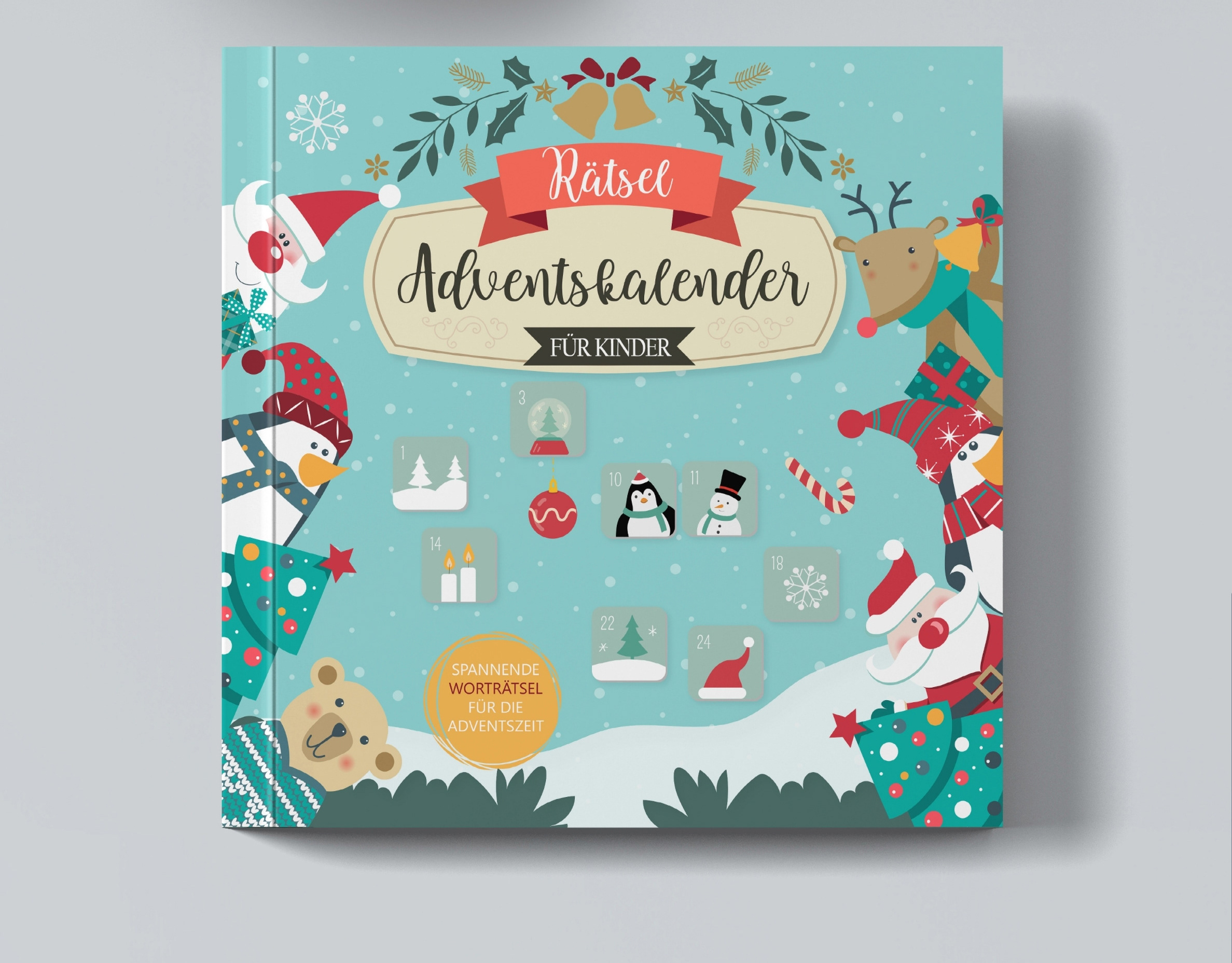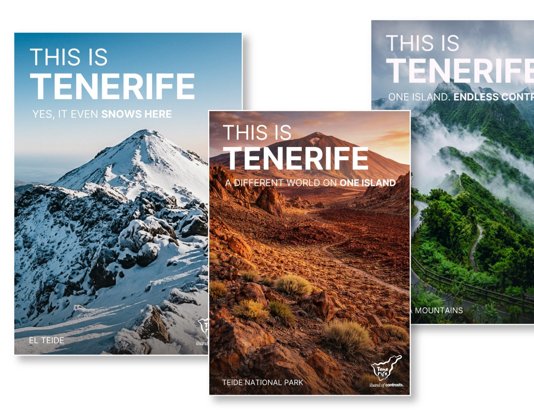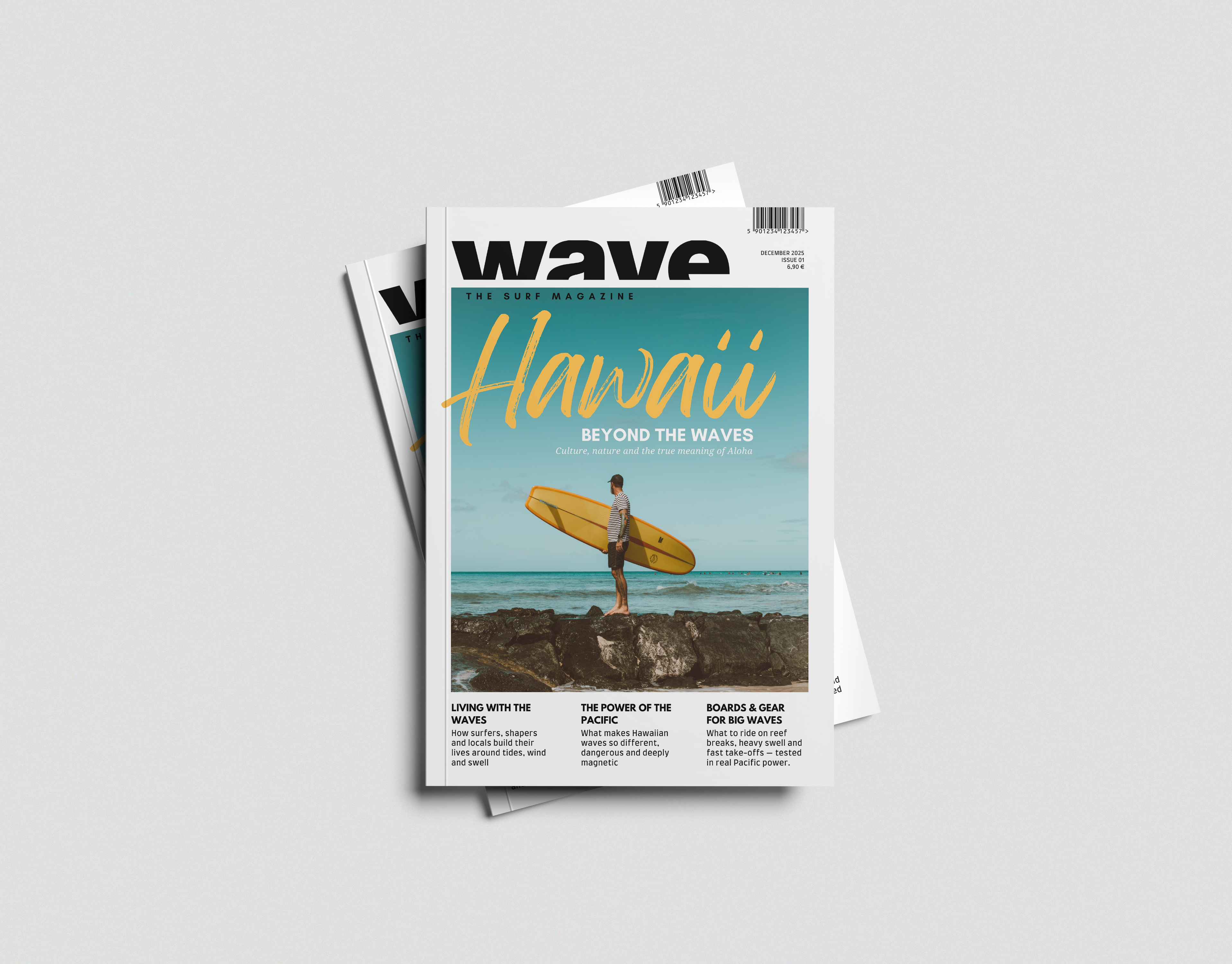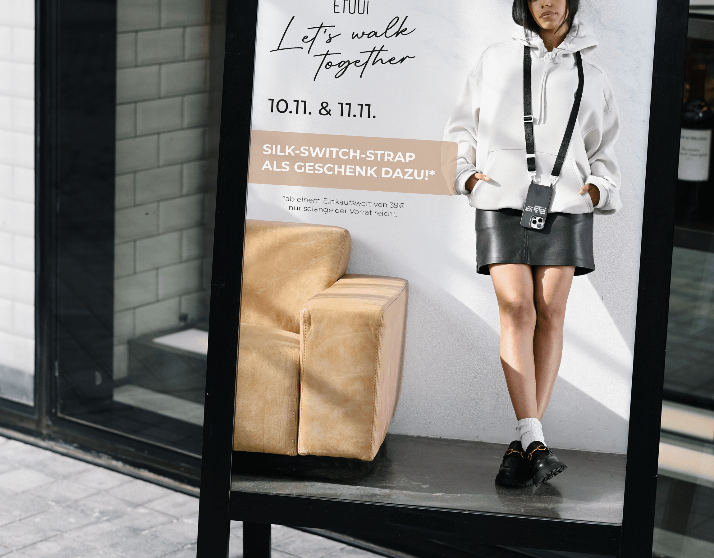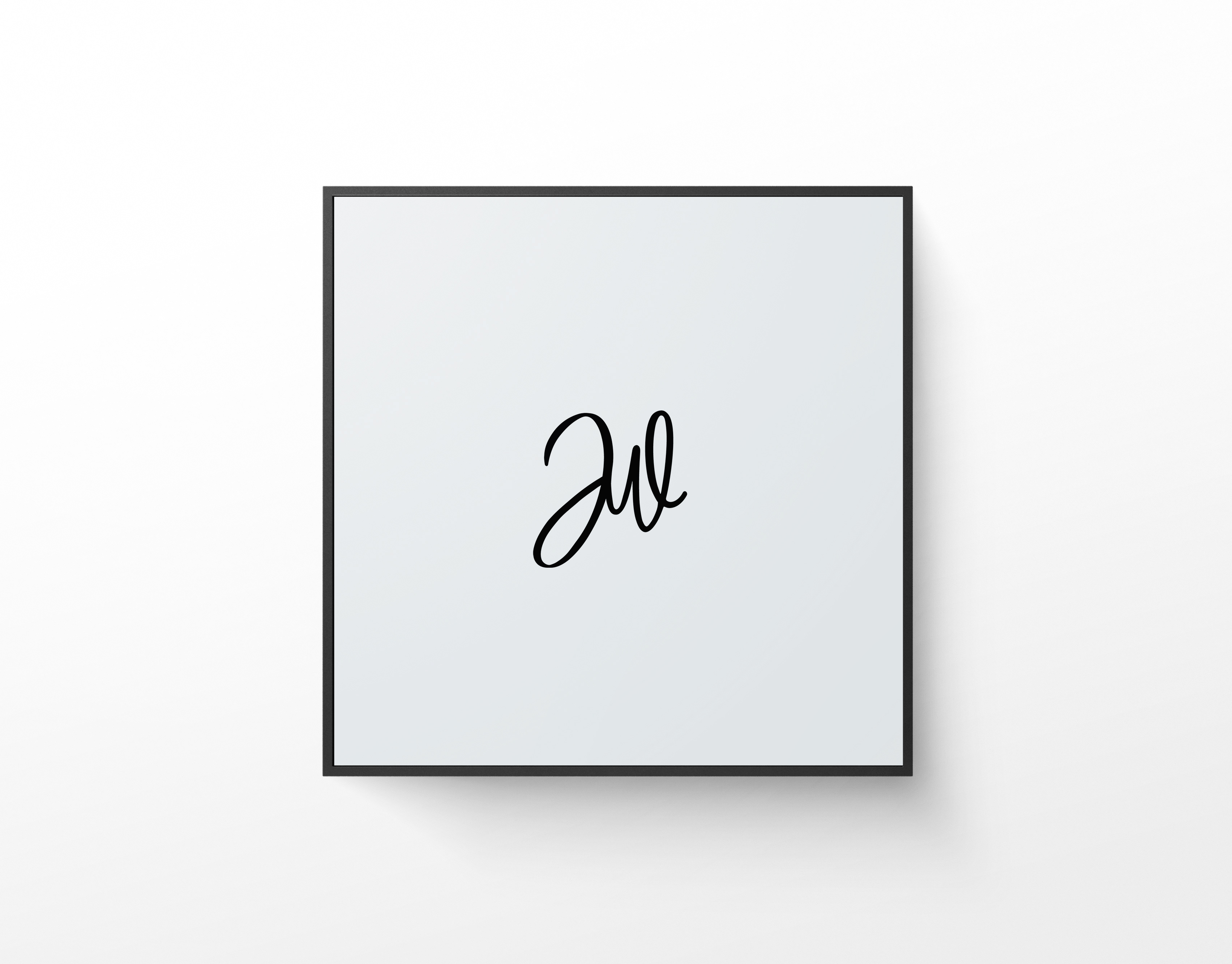
This project was created as part of my graphic design course. The assignment involved designing three monograms based on personal initials, each representing a different typographic category: serif, sans-serif (grotesque), and script (calligraphic).
The monograms were developed in black and white and could be created by hand, digitally, or through a combination of both methods. An additional variation supported by AI-based tools was optionally explored. The focus of the task was to create monograms that are both legible and visually compelling while achieving strong typographic presence.
Through this exercise, key typographic principles such as proportion, spacing, bleed, and perspective were applied to create dynamic letter combinations and balanced compositions. The project trained a sensitive typographic eye, strengthened confidence in working with different type styles, and emphasized maintaining consistent design quality across varying typographic expressions.