Typographic Magazine Cover – “Wave” Surf Magazine
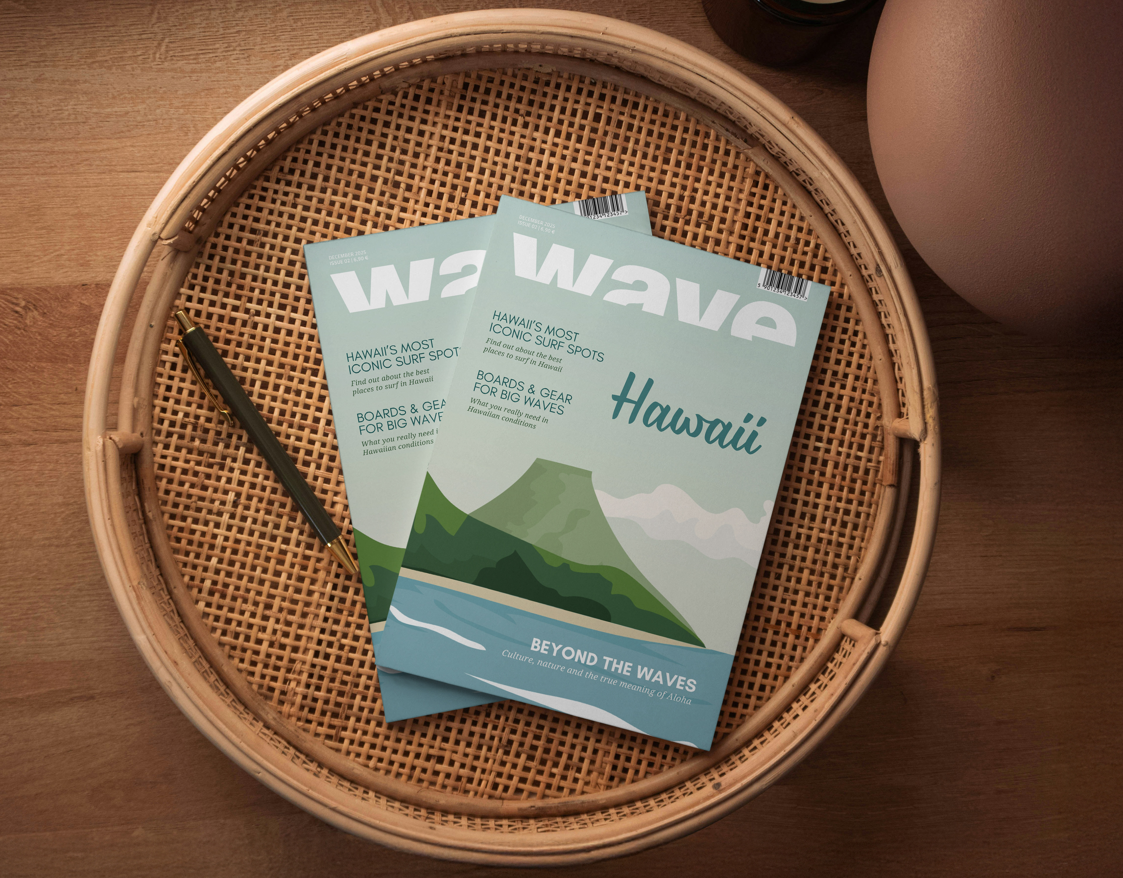
This project presents a typographic cover design for the surf magazine Wave, focusing on Hawaii as the central theme.
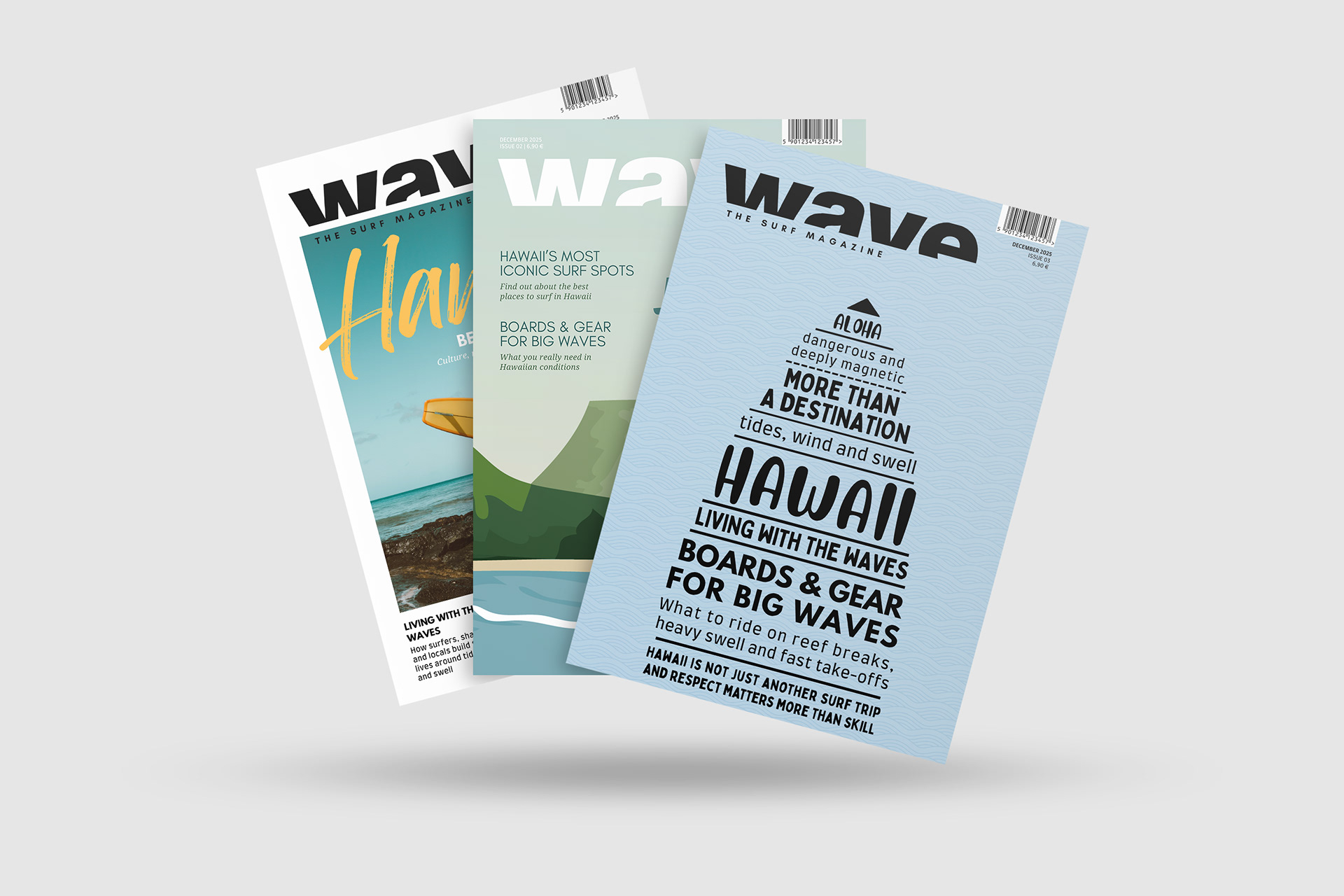
The overall project explores the title theme through three design approaches—photographic, illustrative/abstract, and typographic—each developing its own visual language while remaining clearly recognizable as a surf magazine.
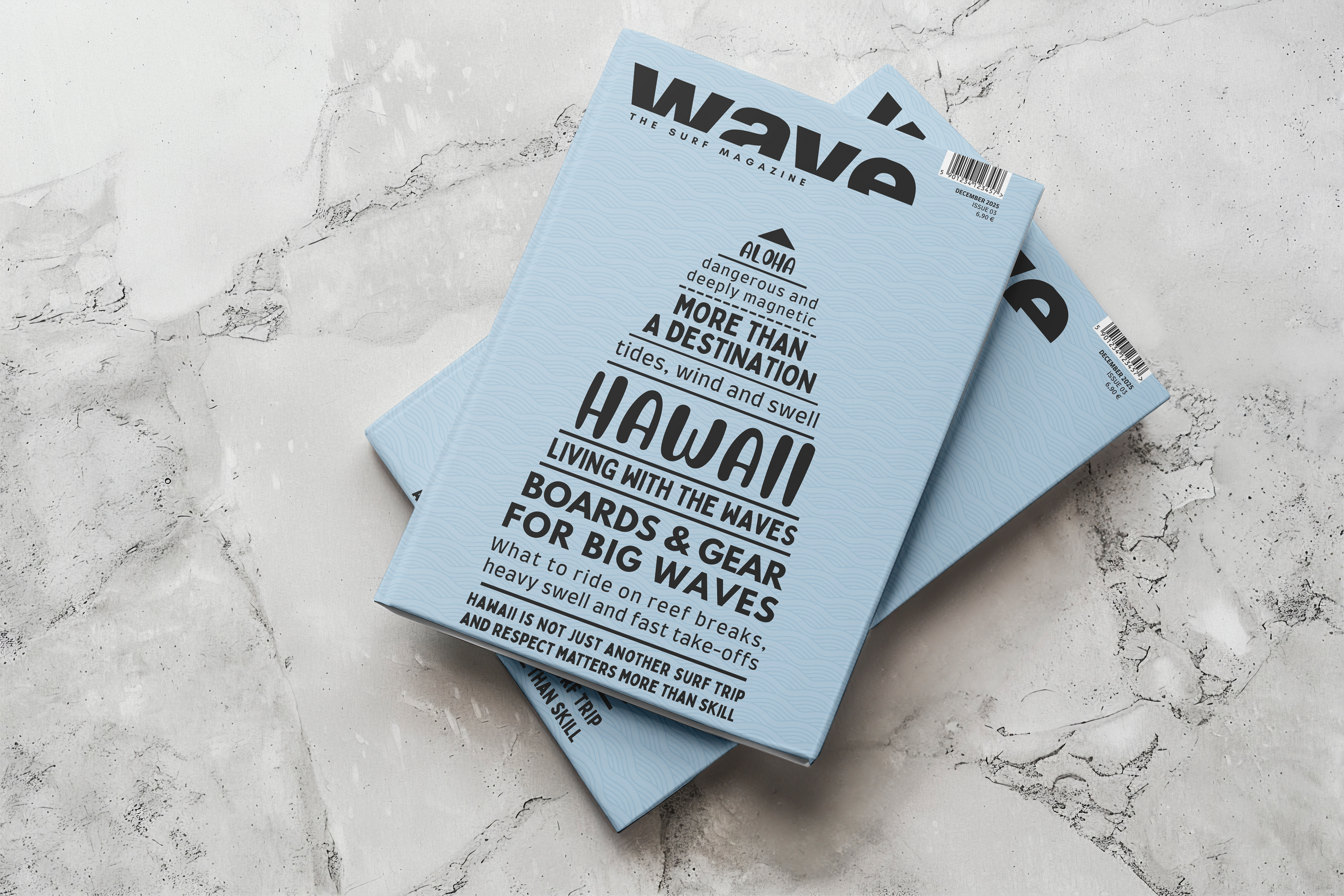
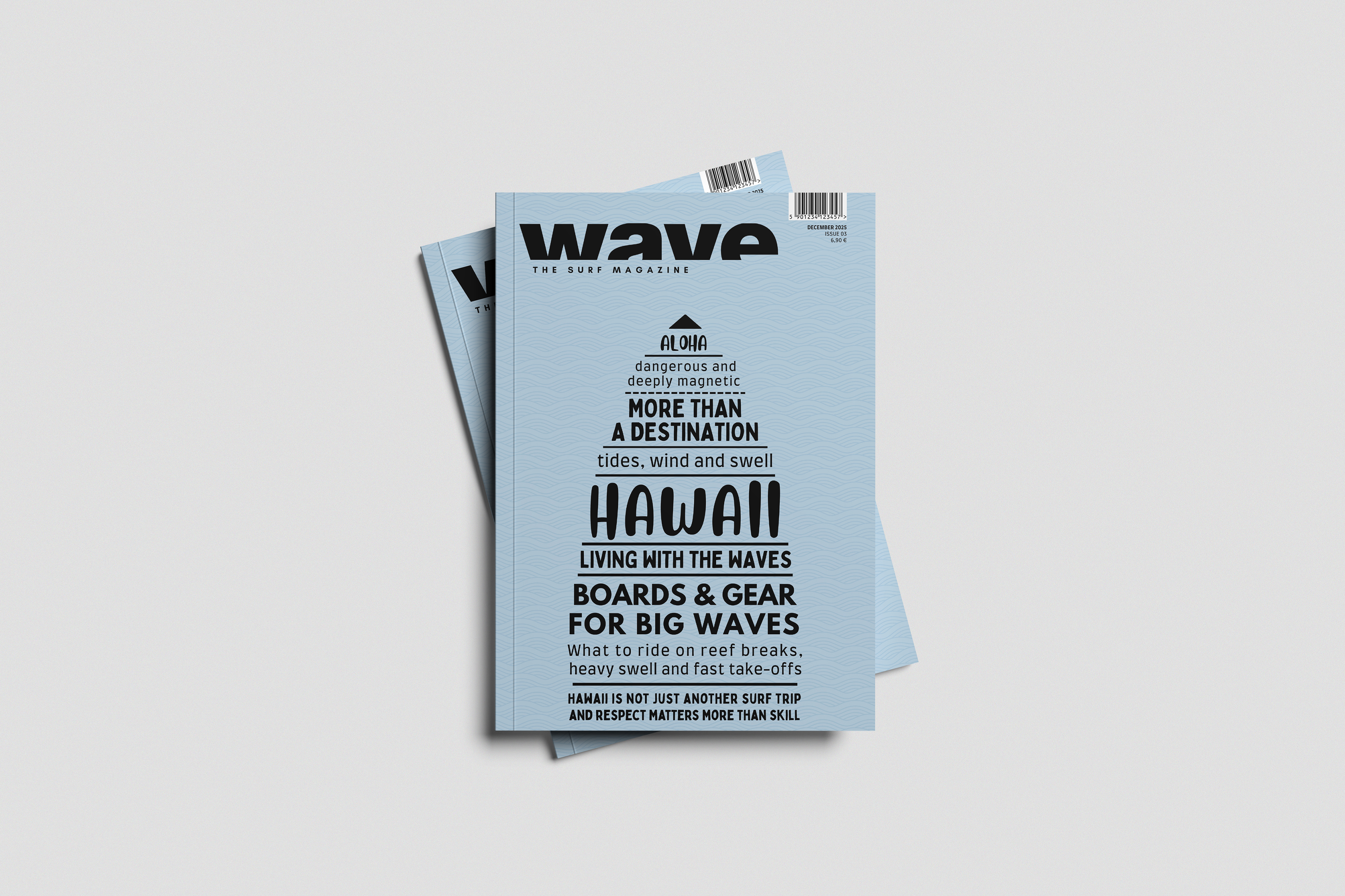
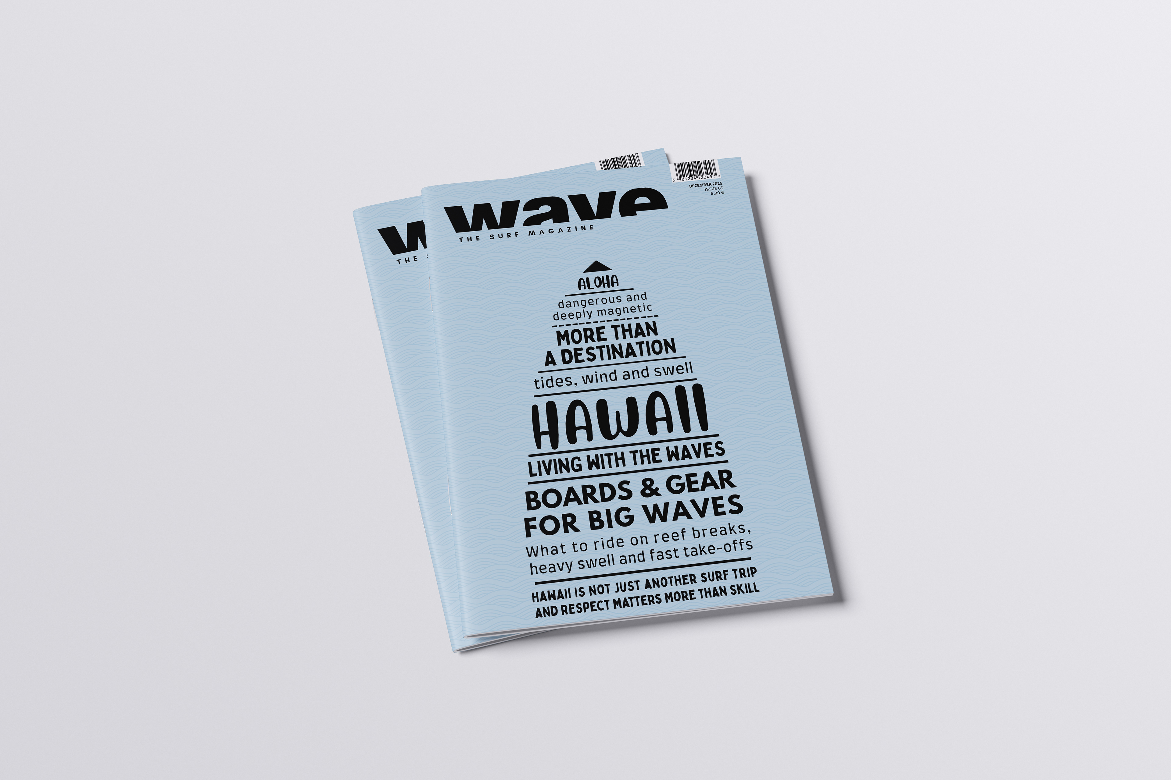
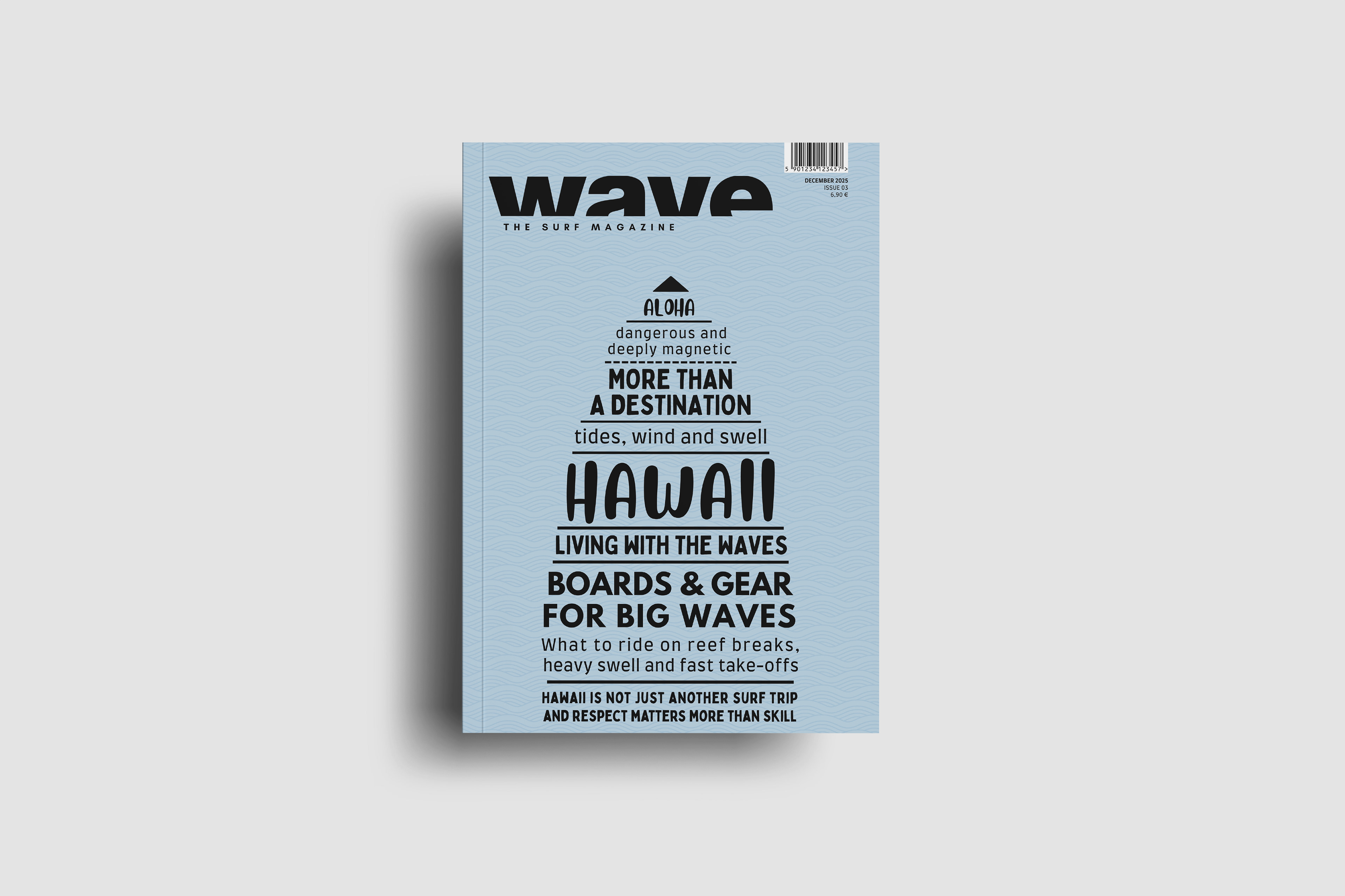
This cover focuses entirely on typography as the main design element.
The concept is based on reduction and clarity. Through type, color, and composition alone, the cover creates a strong association with surfing and Hawaii. The color palette is deliberately limited to blue and black, referencing the ocean, waves, depth, and openness. Subtle wave textures in the background add depth without distracting from the typographic focus.
The text layout is arranged to suggest the silhouette of a surfboard, creating an immediate visual connection to the theme—even without reading the text.
A combination of typefaces is used intentionally: modern, clean fonts ensure readability, while more playful, Hawaii-inspired fonts add character and atmosphere.
Text hierarchy is clearly structured, allowing the main title “Hawaii” to stand out at first glance, followed by secondary topics.
The overall style is reduced, timeless, and conceptual. By focusing on typography, the cover distinguishes itself from more image-driven surf magazines and emphasizes graphic clarity and idea-driven design. Supporting information is placed discreetly in the top right corner to preserve the visual strength of the typographic composition.